The shade colour based on the wall shade
A white shade on a dark wall clashes; a tone-on-tone shade blends
The lampshade is the textile element no one thinks to coordinate with their interior. It is also one of the elements that changes a room the most.

What colour lampshade should you pick for your wall?
Coordinate the shade with the room's palette, like a cushion. Three strategies: disappear in the wall's tone, dialogue in a close shade (natural ecru linen, the most versatile), or assert with a marked colour. Pick one per room, and check the effect both on and off.
§ 01The principle
The lampshade does two things simultaneously. It diffuses light downward and sideways, filtering the warmth of the flux. And it occupies a visual volume in the room, on or off. Its colour therefore affects both the quality of light emitted and the visual presence of the lamp.
Three strategies coexist, as with doors (rule 01.10) and skirting boards (rule 01.11). Disappear in the wall's tone. Dialogue in a close but distinct shade. Assert in a marked colour or pattern.
The professional rule: the lampshade must be treated as a textile element to coordinate with the room's palette, not as a technical accessory bought with the lamp.
To apply this rule: See selectionAffiliate

Disappear · Dialogue · Assert
Three strategies, as with doors. One choice per room.
§ 02Putting it into practice
Strategy 1: disappear. Off-white shade on off-white wall. Taupe shade on taupe wall. The lamp is only noticed when lit, and the emitted light diffuses while remaining coherent with the palette. Safe and elegant choice, recommended in rooms with rich palettes already saturated with visual elements.
Strategy 2: dialogue. Natural linen shade on off-white or beige wall. Cream boucle shade on pale sage green wall. The lamp remains visible but without edge. It is the most versatile strategy, which works in the majority of contexts. Natural linen is the reference material here, because its colour pulls toward both warm and neutral, and it diffuses warm light beautifully.
Strategy 3: assert. Burgundy velvet shade on off-white wall. William Morris floral print shade on plain forest green wall. The lamp becomes a strong decorative object. Reserve for isolated lamps playing the role of artwork, in contexts where the other visual elements are calm.
The material matters as much as the colour. Three main families.
Linen and natural cotton. Warm diffusion, golden light through the fabric. Works anywhere. Absolute reference for 80% of cases.
Silk and bright fabrics. Harder diffusion, more orange light. Reserved for sophisticated interiors, formal salons, reception suites.
Paper (Japanese washi). Ultra-soft diffusion, almost ethereal light. Ideal in bedrooms or for statement lamps (Noguchi, Tala Muse).
- 01Choose the shade as you choose a cushion, in coherence with the palette
- 02Favour natural linen in the majority of contexts
- 03Adapt the strategy to the lamp's role (ambient or focal point)
- 04Check the effect both on and off
- 01A brand new white shade on a dark patinated wall, brutal contrast
- 02Buying the shade that comes with the lamp without coordinating it
- 03Mixing several strategies in the same room
- 04A glossy shade for a bedroom
§ 03Professional variations
British interior designers (Cabana Magazine, Soane Britain) are the undisputed masters of the lampshade as a textile element. They offer printed shades (floral, geometric patterns) coordinated with cushions and curtains. This logic is spreading in continental Europe, notably through Caravane and artisan shade-makers.
Pierre Yovanovitch works almost exclusively strategy 2 (dialogue), with linen or ivory parchment shades. They register within the palette without disturbing it.
A sophisticated practice: changing shades with the season. A pale linen shade in summer, a denser velvet shade in winter. The cost (£50-80 for a quality shade) remains reasonable, and the effect on the room's atmosphere is notable.
The shade is a textile, not a technical accessory. Choose it like a cushion.
---
# End of Chapter 02
Twelve rules delivered. Approximate total: 12,200 words, 36 annotated visual placements.
For this rule
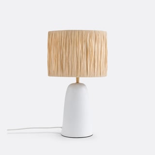 Lampe Neven · terracotta et raphiathe centerpieceSee
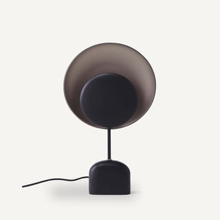 Lampe Naton · métal noir et mokathe graphic touchSee
- Lampe Vigo · céramique terracotta abat-jour beigethe affordable one, warm feelSee
Affiliate links · See our transparency →
And in your room — is this rule respected?
Photograph your room. The AI checks it against all 114 rules of the manual and returns the concrete fixes to apply this weekend.
Audit my roomFree, no sign-up. Analysed in under a minute.
One measured rule, every Tuesday.
Good measurements are worth keeping. Get The Bulletin: one décor rule explained in depth, Tuesday morning. Four minutes, zero noise.