
The 5 mistakes people with good taste make
It isn't lapses of taste that spoil a home. It's lapses of logic, made by people who know what they're doing.
First issue, a clarification to begin. The most stubborn mistakes in well-decorated homes aren't mistakes of taste, they're mistakes of logic. Decisions made with care, in the right register, but badly articulated with one another. This bulletin doesn't repeat what's already on the site. It names what you no longer see, from having had it in front of you too long. Five mistakes this Tuesday. You make at least one.
The TV wall
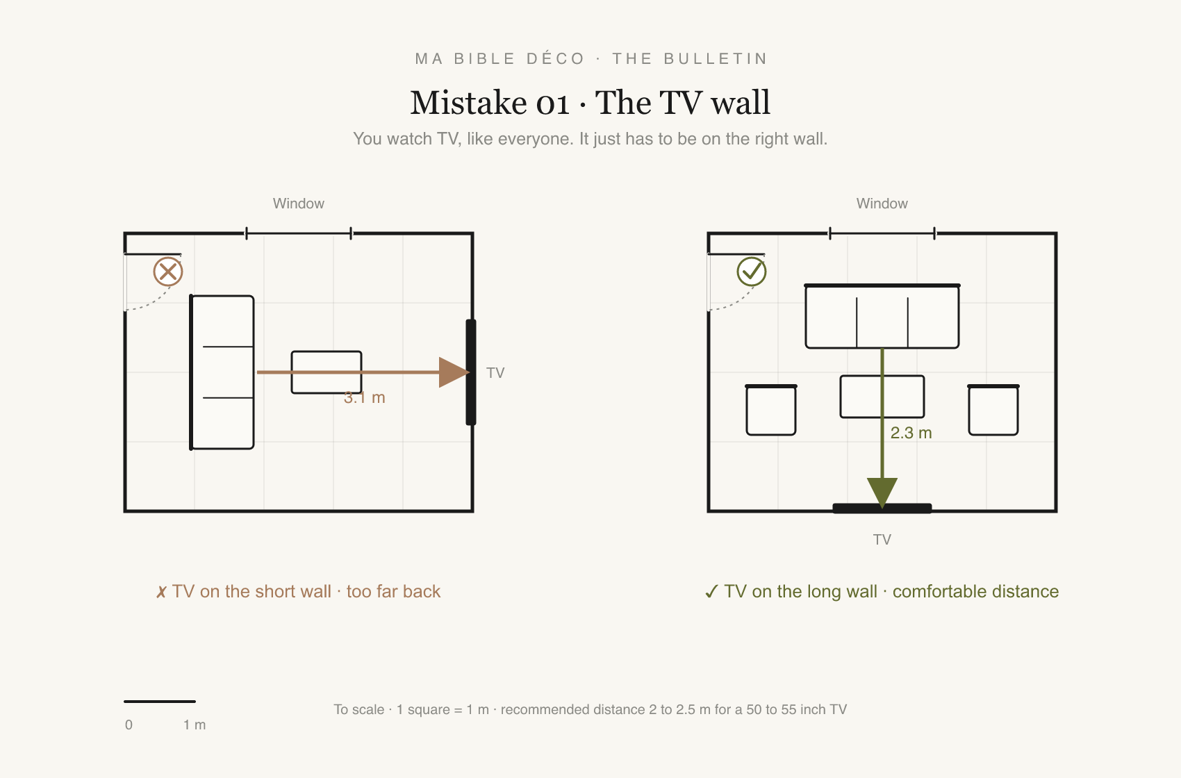
You watch television, like almost everyone, and that isn't the problem. The problem is the wall you gave it. Set on the shortest wall, where the socket happened to be, it stretches the whole room lengthwise. The sofa sits too far back, the room becomes a corridor.
The fix is a single move. Put the screen on the long wall. The viewing distance drops to between 2 and 2.5 metres for a 50 to 55 inch TV, the seating anchors, the width of the room finally works. You keep your shows, you get your living room back.
The undersized piece
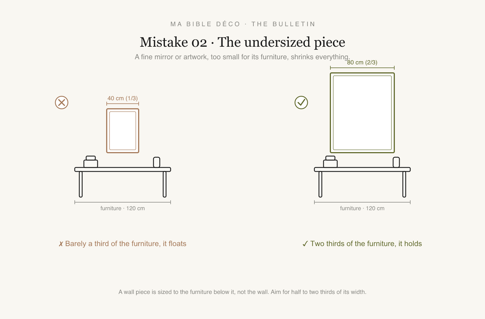
You have a mirror you love, a piece of art you searched for. Hung alone above a console, it looks timid. It isn't the piece, it's the size. Something too small doesn't decorate furniture, it makes it look emptier.
Size it to the furniture below, never to the wall. Aim for half to two thirds of its width. Above a 120-centimetre console, that's 60 to 80. Below that, the piece floats and everything shrinks with it.
The showroom living room
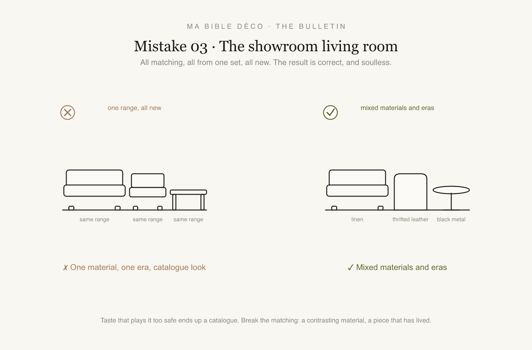
You chose everything carefully, from the same range, the same shop, the same year. Sofa, armchairs and table answer each other perfectly. That's exactly the problem. A room that's too coordinated looks like a catalogue page, correct and without memory.
Break the matching. A contrasting material, black metal against pale wood, linen against leather. And at least one piece that has lived, thrifted or inherited. It's the gap, not the match, that makes a room feel composed over time.
The overused accent
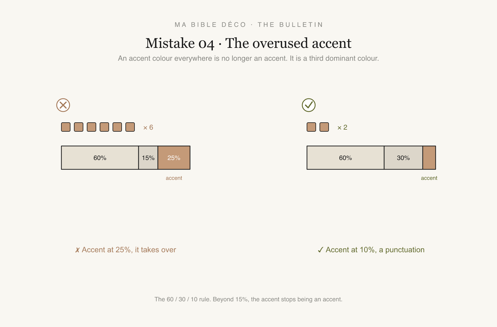
You chose an accent colour, and it was a good choice. A deep green, a clear terracotta. Then you put it on the cushion, the vase, the frame, the throw, the candle. By the sixth time, it's no longer an accent, it's a third dominant colour, and the composition flattens.
Hold the 60/30/10. Sixty per cent dominant, thirty secondary, ten accent. Beyond fifteen per cent, the accent stops accenting. Two or three echoes are enough, not six.
The gallery wall
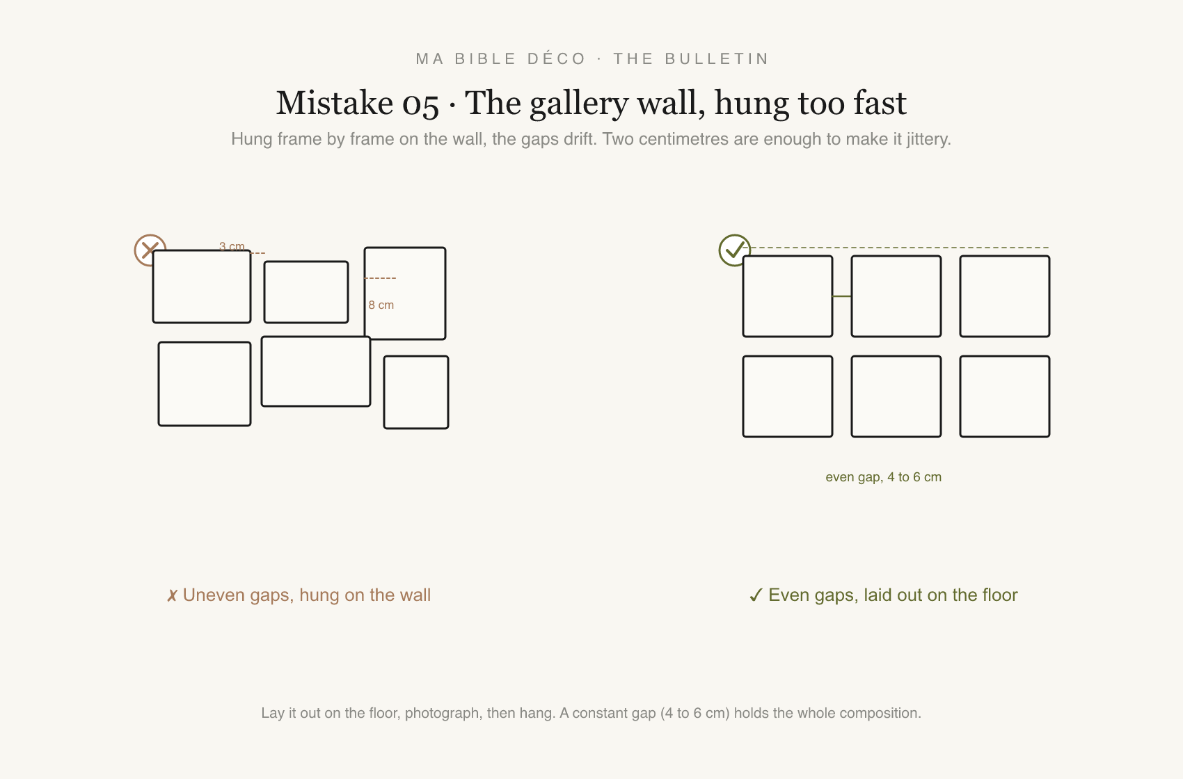
You have good frames and a good idea. You hung them straight on the wall, one after another, by eye. The result is almost right, and it's that almost that grates. The gaps run from three to eight centimetres and the whole thing looks jittery without your knowing why.
Cut a paper template to the size of each frame and stick them on the wall with Blu-Tack. Adjust the gaps by eye, directly on the wall, before you drill. Photograph before removing the templates. It's more precise than the floor layout method — and it works even when you don't have the space to spread everything out.
If you recognised one, that's a good sign. The rest is already in place.
From next Tuesday, we unfold one per issue. The gallery wall set to the millimetre, the accent dosed piece by piece, technical diagrams included. One mistake, one Tuesday, all the way through.
In the meantime, the manual covers each of these rules.
Read the full rules